
VERSA
Website
Timeframe: 2025
Role: UI and UX Design
VERSA is a digital agency focused on innovative technology and creative solutions. As they evolved their positioning and strategy, I led the full redesign of their website, creating a futuristic and immersive digital experience that better reflected their work. I shaped the project from research and information architecture through visual and interaction design, collaborating with the client, interaction designer and development team to bring it to life.
Design Challenge
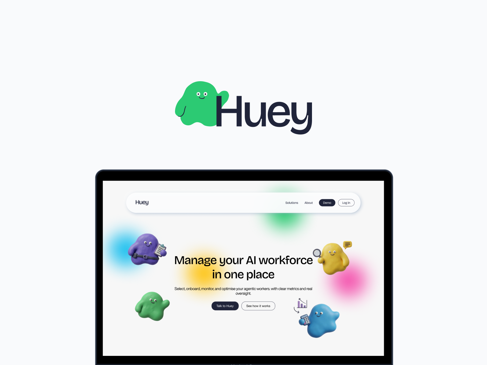
The start of this project was a tricky balance: I was given a lot of creative freedom, but also a lot of competing direction. Huey was a brand new name with no market presence, so there was nothing to build on — I had to construct the identity entirely from scratch. The bigger challenge was differentiation: most tools in the agentic/AI-management space lean on cold, technical, dashboard-heavy visuals, so the brief was to create something that felt distinct, warm, and a little unexpected without losing credibility.
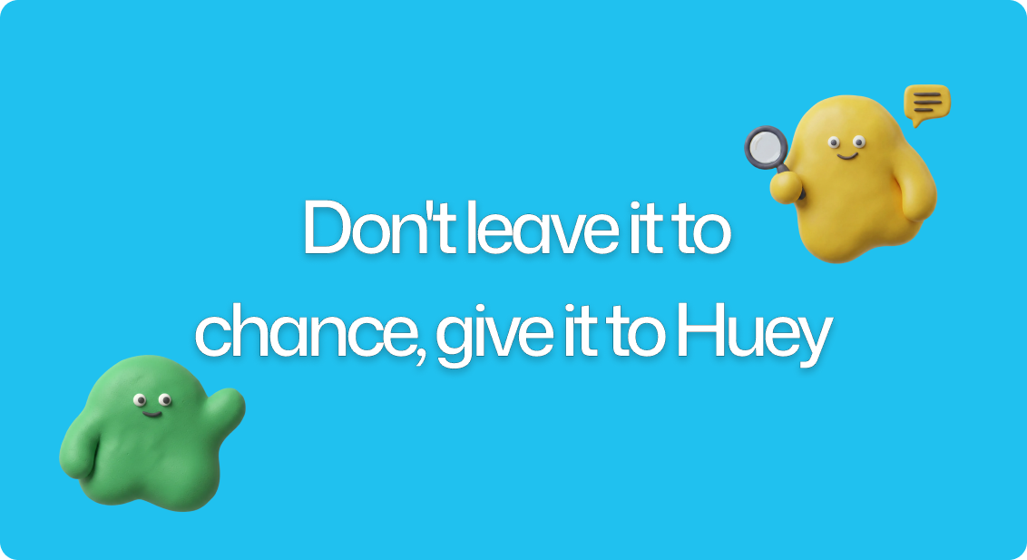
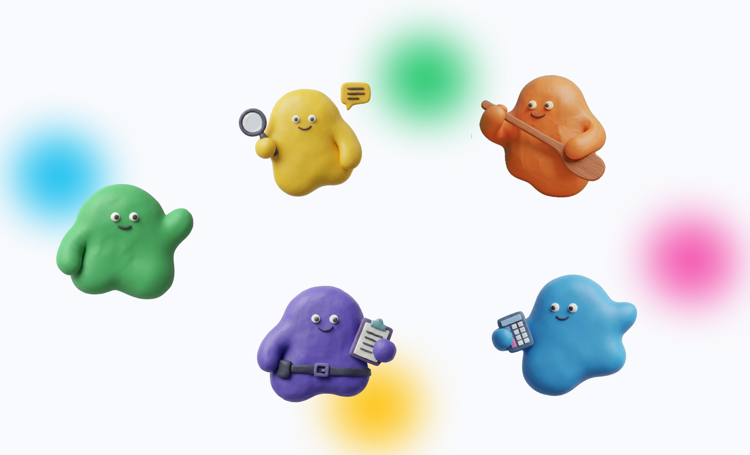
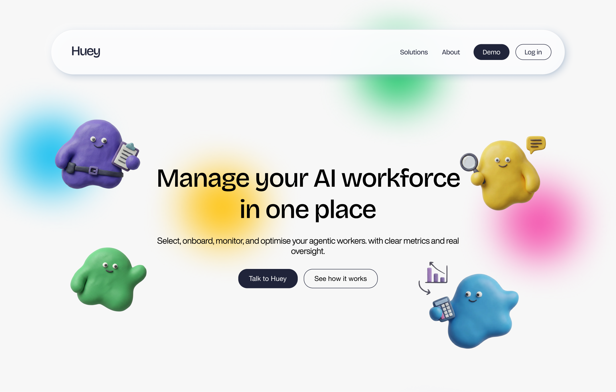
The concept I landed on treats Huey as a collective of small assistant characters, each representing a specific skill or role and each with its own personality — communicated through colour, icon, and props, plus playful "stats" that hint at their expertise and reliability. The tone is friendly and slightly cartoony, closer to claymation than corporate SaaS, but still polished enough to build trust. Group scenes lean into teamwork and coordination, reinforcing Huey's core idea: a unified, task-ready workforce rather than a single faceless AI tool.
User Research Approach
Since Huey launched as a brand-new identity with no existing market presence, the research focus was less about optimizing an established product and more about defining who Huey is, who it's for, and how to make that legible at a glance. I combined direct client collaboration with lightweight testing at each stage of the identity's development.
1. Stakeholder Interviews (N=2 Participants)
I interviewed both business owners early in the process to establish the brand's core tension: they wanted Huey to feel fun yet serious, and helpful without tipping into generic or boring — a claymation aesthetic balanced against minimalism, rather than full illustration overload. They were also clear that, at this pre-launch stage, the site needed to explain what Huey does clearly, without over-exposing how the platform works. The target audience spans both large and small businesses and organisations, which shaped the need for a brand flexible enough to feel credible in an enterprise HR context and approachable in a smaller team's hands.
2. Brand Positioning Workshop
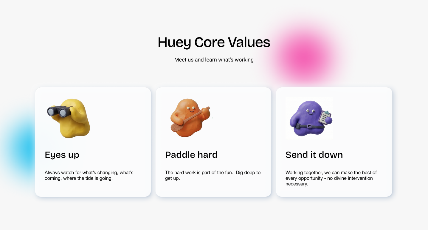
Together with the interaction designer, I ran a positioning workshop with the client to define what the brand should represent beyond the product itself. We prepared a structured questionnaire, supplemented by questions that emerged naturally in conversation, and used a set of brief visual and verbal concepts to help the client react to and refine a direction rather than describe one from scratch. This process produced Huey's Core Values:
Eyes up — Always watch for what's changing, what's coming, where the tide is going.
Paddle hard — The hard work is part of the fun. Dig deep to get up.
Send it down — Working together, we can make the best of every opportunity — no divine intervention necessary.
3. Competitive Analysis
Together with the interaction designer, I ran a positioning workshop with the client to define what the brand should represent beyond the product itself. We prepared a structured questionnaire, supplemented by questions that emerged naturally in conversation, and used a set of brief visual and verbal concepts to help the client react to and refine a direction rather than describe one from scratch. This process produced Huey's Core Values:
Eyes up — Always watch for what's changing, what's coming, where the tide is going.
Paddle hard — The hard work is part of the fun. Dig deep to get up.
Send it down — Working together, we can make the best of every opportunity — no divine intervention necessary.
4. Persona Definition
Based on the stakeholder interviews and target audience (businesses managing agentic AI teams across departments), I developed role-based personas to guide both messaging and UX decisions — including an HR Lead and a Call Centre Manager (below).
5. Visual Exploration Testing
I presented the client with three distinct concept directions to react to before committing to a full identity:
Concept 1 — Fun, claymation-inspired, balanced with minimalism
Concept 2 — Tech-forward and corporate, with a more restrained colour palette
Concept 3 — A single animated 2D character representing Huey as one persona
The client selected Concept 1, validating the direction to build Huey's identity around a collective of characters rather than a single mascot or a purely corporate system.
6. Design System Usability Review
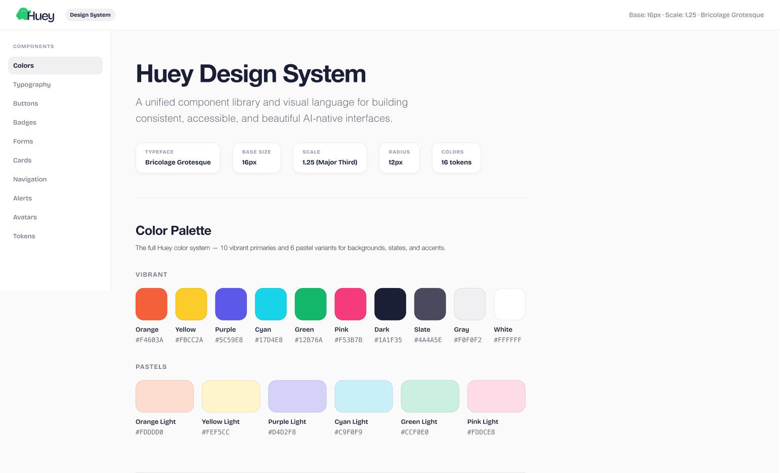
Since the design system is interactive and clickable, I observed a client and a developer navigating it unprompted. Both were able to move through it without guidance, confirming that the system was intuitive for non-technical and technical users alike — an important signal given the system needed to serve designers, developers, and the client team going forward.
Logo and Branding
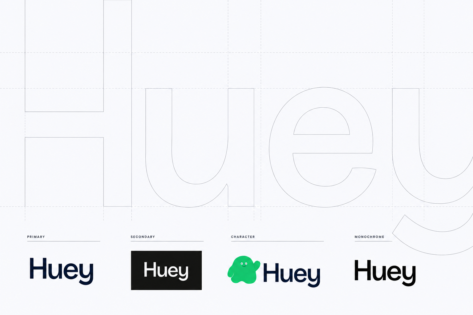
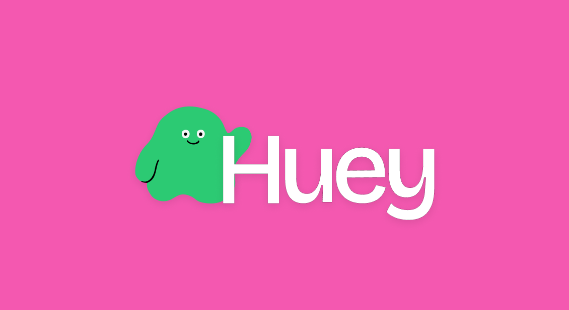
The identity grew directly out of the positioning work with the client: fun yet serious, helpful without being generic. I explored three distinct directions — a claymation-meets-minimalism concept, a more restrained tech-corporate route, and a single animated 2D mascot — before landing on the character-driven system that became Huey. For the logo itself, we settled on the wordmark as the primary mark, keeping it clean and flexible across contexts, while the client has the option to pair it with the character lockup where a friendlier, more expressive touch is needed. From there, the identity expanded into a full collective of characters, each carrying its own colour, prop, and personality, so the brand could represent a whole team of agents rather than a single static logo.
Design System
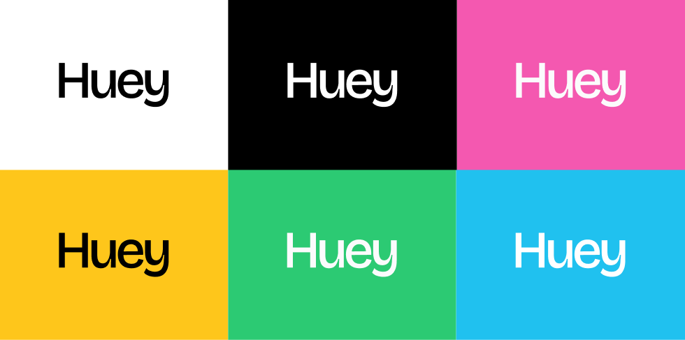
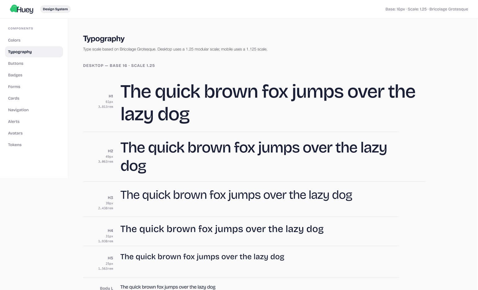
To keep the Huey brand consistent across the website, product UI, and marketing materials, I built an interactive design system rather than a static style guide. It's fully clickable — components, colour combinations, and typography can be explored directly rather than read off a spec sheet — and structured so pieces can evolve alongside the brand without breaking consistency elsewhere. I tested it with both the client and a developer navigating it unprompted; both found it intuitive, confirming it works as a shared reference point for designers, developers, and the client team alike.

Before any visual design began, I built wireframes to establish content and information architecture, refining these with the client across several sessions with user journeys in mind — how an HR lead, a call centre manager, or an IT decision-maker would actually move through the site and find what they needed.
Once the structure was agreed, I carried the claymation-driven identity into the live pages: characters anchor the hero and section breaks, colour blocks from the palette organise content (like the split Security/Services/APIs vs. Agent view in the ecosystem section), and the tone stays consistent with the brand's "fun yet serious" positioning throughout, from the homepage down to smaller moments like the 404 page. Layouts were also adjusted and designed with mobile use in mind, so the character illustrations, colour blocking, and content hierarchy hold up across screen sizes rather than being a desktop-only experience.
Website
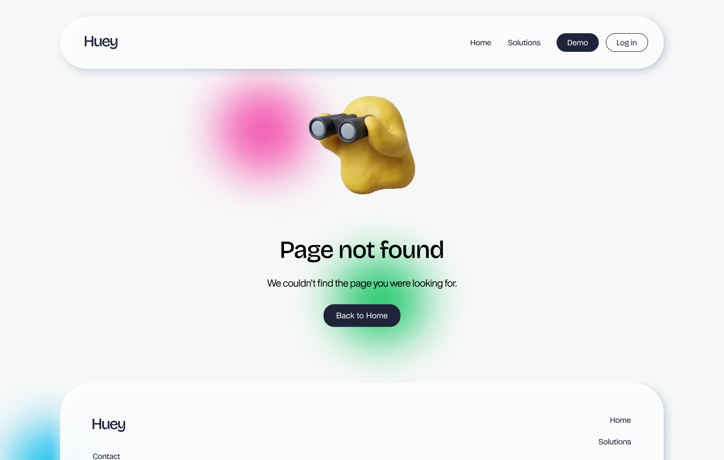
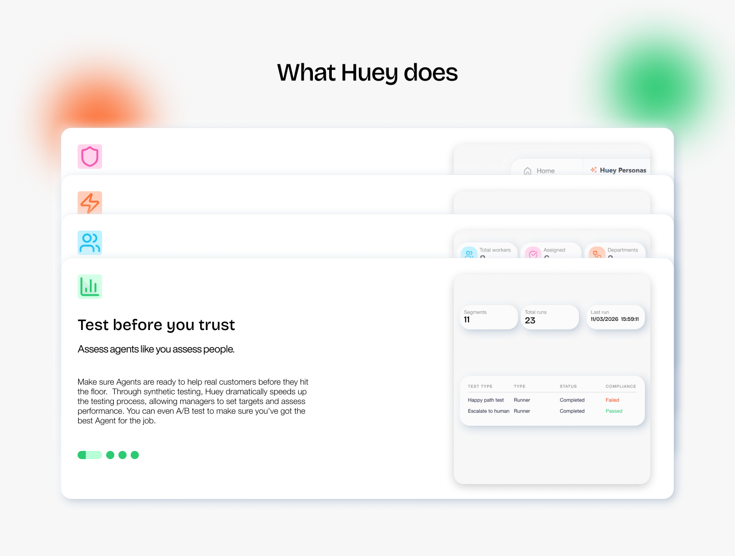
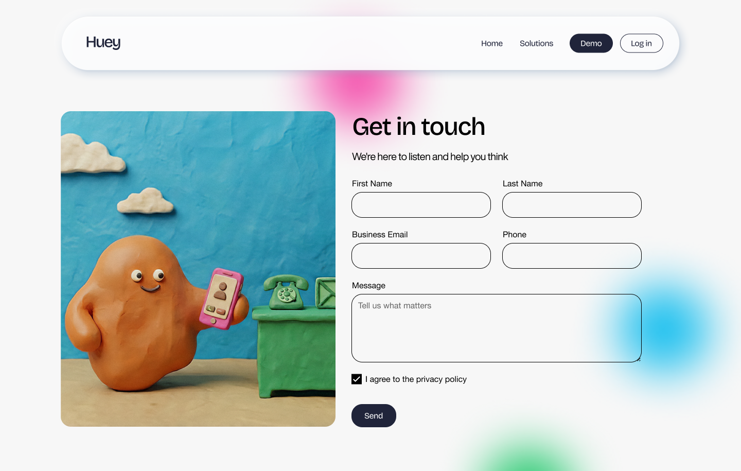
This project stood out as a particularly rewarding collaboration. The client placed a high degree of trust in my creative direction, granting considerable freedom from the initial brand exploration through to the final website build. This trust translated into an efficient working process — strategic recommendations were adopted quickly at each stage, minimising revision cycles and enabling faster decision-making throughout. As a result, the complete brand identity, design system, and website were delivered within a one-month timeframe, a pace that reflects both the strength of the collaboration and the clarity of direction established early in the project.
Conclusion
Design Process
-
Conducted comprehensive research into user needs and pain points.
-
Gathered insights from analytics and user feedback.
-
Developed a clearer, more efficient app structure.
-
Created a visually appealing and intuitive interface.
-
Iterated based on user testing and feedback.
-
Worked closely with developers to bring the design to life and correct errors.