
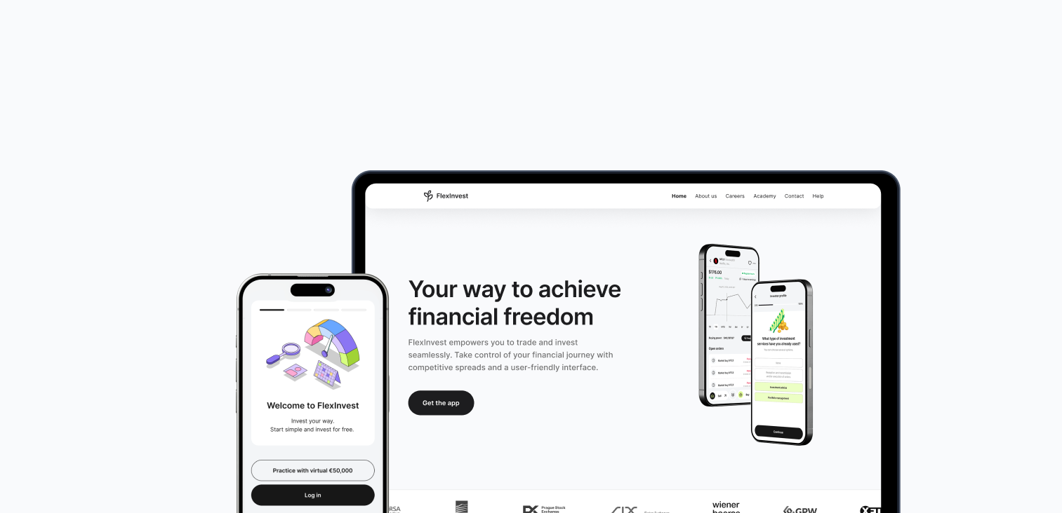
FlexInvest
Trading application and website design
Timeframe: 2022-2024
Role: Design Lead
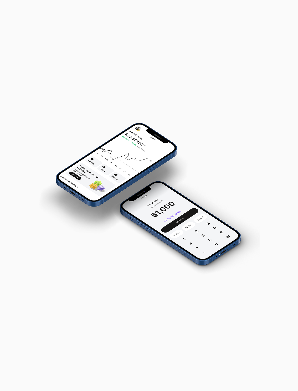
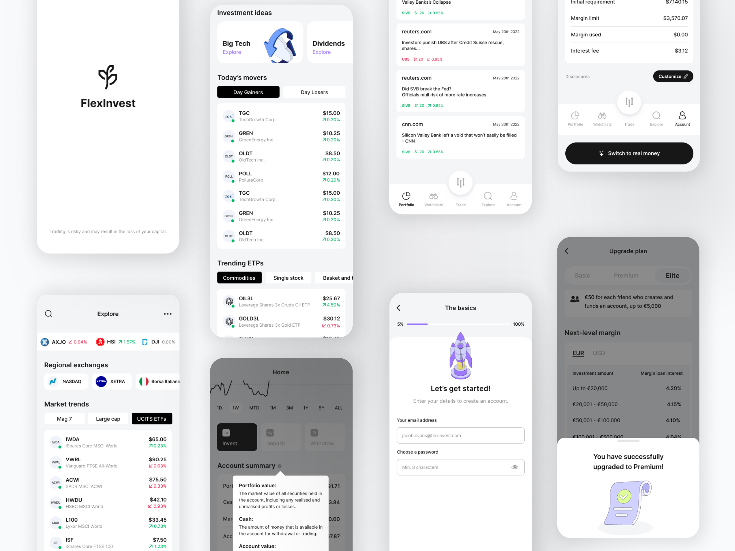
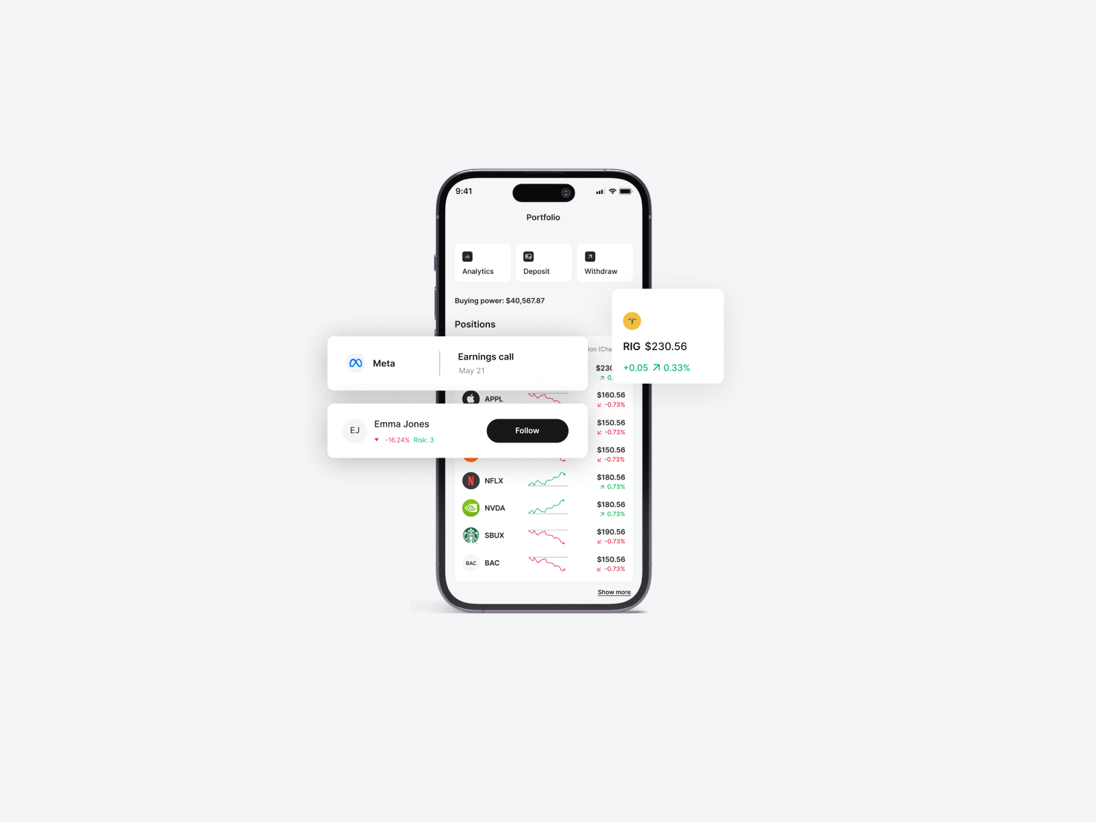
FlexInvest is a mobile trading application designed to simplify investing for both beginners and experienced investors. The goal was to create an intuitive, transparent, and user-friendly investment platform that lowers barriers to entry while providing smart automation and insights.
Design Challenge
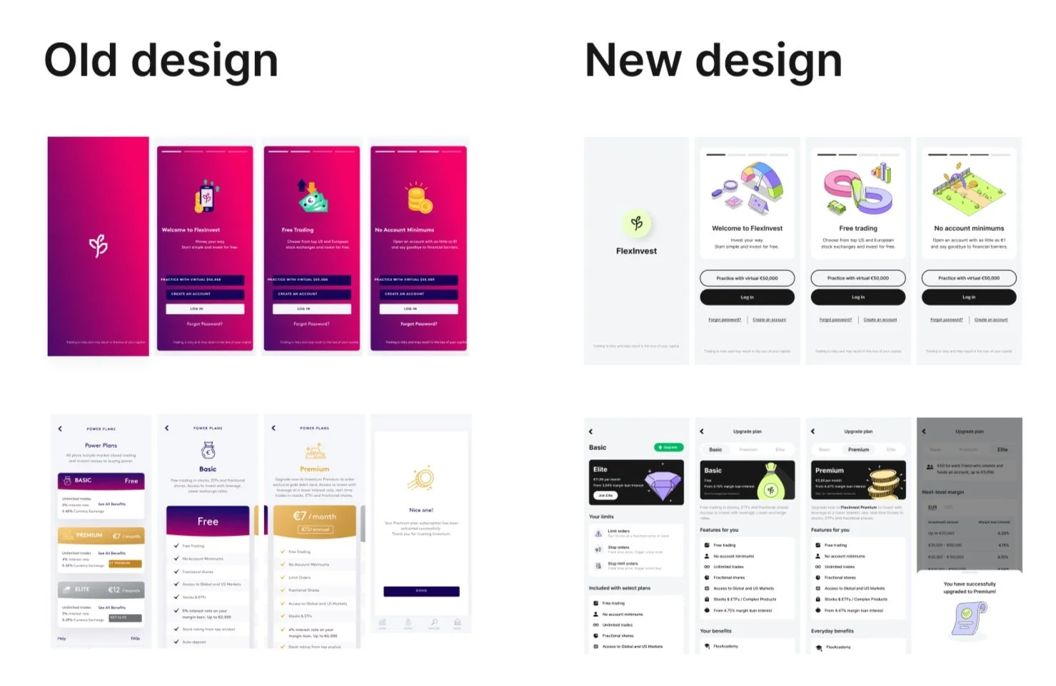
When I joined the project, the existing design was inefficient and overly complex. The app was not fully developed. The user flows were too long, and the overall experience wasn’t user-friendly. We found issues related to the color palette and the icons used so we started from scratch.
Many individuals hesitate to invest due to a lack of financial knowledge, fear of loss, and the complexity of existing platforms. How might we design a seamless, educational, and engaging experience that encourages users to invest confidently?
User Research Approach
To ensure the platform met user needs, we conducted extensive UX research using a combination of qualitative and quantitative methods.
1. User Interviews and Surveys(N=20 Participants)
Trust is a major barrier – 75% of beginners fear financial loss and hidden fees. Simplicity drives adoption – 85% prefer a minimalist, jargon-free interface.
Education is a missing feature – 65% want built-in investment tips and risk explanations.
Automation is highly desired – 70% find auto-investing appealing.
Transparency matters – Users want clear fee breakdowns and risk warnings.
2. Competitive Analysis(Robinhood, Trading212, Interactive Broker, Coinbase)
Competitors have complex dashboards – Opportunity for a cleaner, intuitive experience.
Lack of educational tools – Potential for in-app learning features.
Inconsistent trust & security messaging – Need for clear onboarding explanations.
3. Personas Developed
Emma (Beginner Investor, 26, Digital Marketer)
Needs guided investment steps.
Afraid of losing money & hidden fees.
Prefers auto-invest options.
David (Intermediate Investor, 35, IT Consultant)
Wants better analytics & insights.
Frustrated by slow onboarding in other apps.
Interested in sustainable investment options.
4. Usability Testing
Prototype Testing (N=8 participants, Figma Prototype)
Onboarding must be faster – A 5-step process was ideal, anything longer led to drop-offs.
Graph overload – Beginners wanted simplified charts & a "Beginner Mode."
Missing trust signals – Adding "Secured by Bank-Level Encryption" increased confidence by 30%.
Customization improved engagement – Users preferred setting risk levels upfront.
5. A/B Testing on Call-to-Actions (CTA) (N=500 Visitors)
"Start Investing Today" – 12% conversion rate
"Build Your Future, One Step at a Time" – 18% conversion rate
"Smart Investing, Simplified" – 21% conversion rate
6. Behavior Tracking (Google Analytics, N=1,000 users)
70% drop-off during identity verification. Need for a more engaging verification flow.
82% engagement with personalized recommendations – Users valued tailored suggestions.
40% more time spent on app after social investing features – Community-driven elements boosted retention.
90% checked the "Investment Risks" page before their first deposit – Validating the need for transparent risk communication.
7. User Feedback (N=250 Feedback Submissions)
Common complaints:
More tooltips are needed for financial terms. Dark mode is requested by 60%. Deposit verification is perceived as slow (avg. 1 min).
Common praise: "The app makes investing feel safe and easy." ; "The UI is cleaner than other investing apps!" ; "I finally understand where my money is going." "I like how informative and visual the Analytics section is."
Key UX Improvements
Reduce onboarding friction – Optimize KYC verification flow.
Enhance trust and transparency – Emphasize security, fees, and risk disclosures.
Personalize user experience – Let users set risk levels, goals, and investment themes.
Improve educational features – Integrate in-app tutorials and investment glossaries.- Flex Academy
Design System

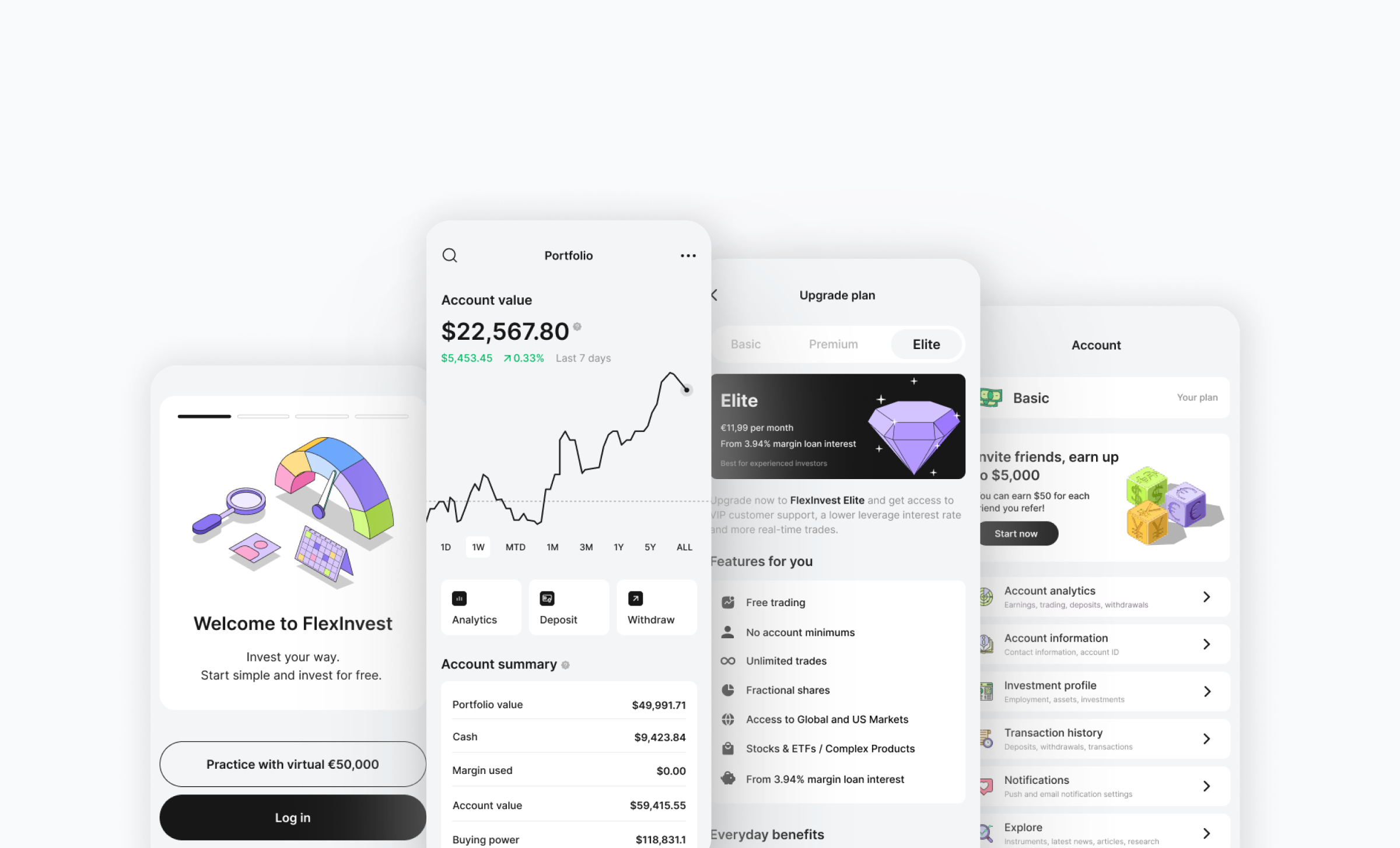
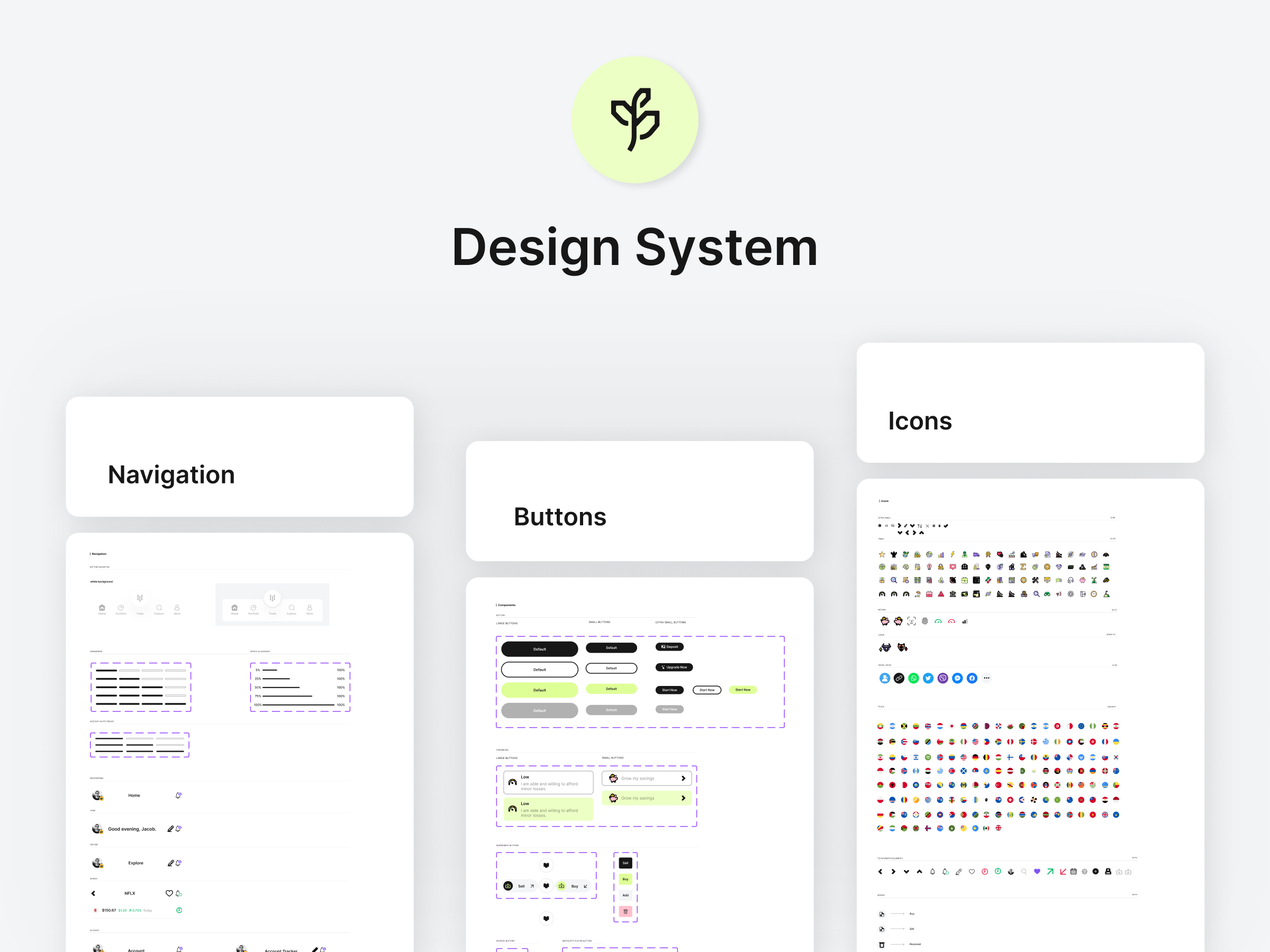
To maintain consistency across the mobile app and website, we developed a comprehensive Design System that included reusable UI components, standardized typography, color schemes, and responsive design guidelines. This system streamlined both design and development, ensuring:
Efficiency – Reusable components accelerated the workflow.
Consistency – A cohesive interface across all platforms.
Scalability – Easy expansion and updates without disrupting the design.
Collaboration – Clear guidelines improved teamwork between designers and developers.
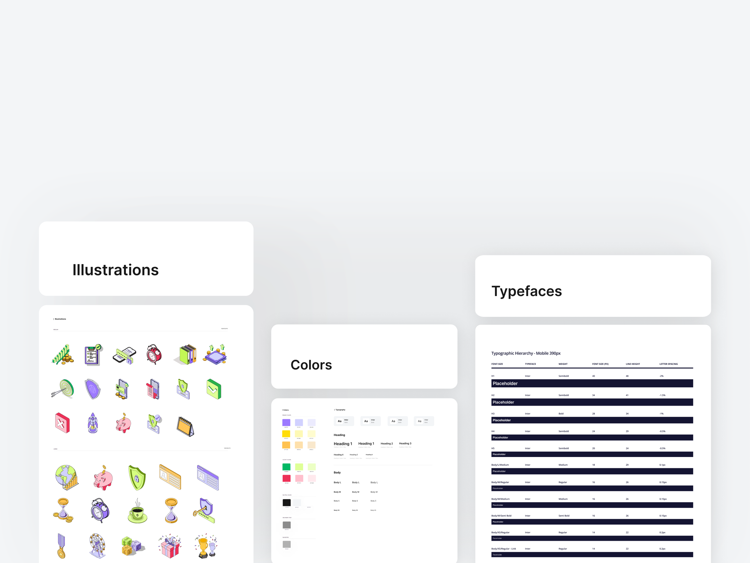
The original website presented several challenges, including an inconsistent color palette, low-quality mockups, poor structural organization, and inefficient user flows. Additionally, some pages were either non-functional or suffered from slow loading times.
To address these issues, we completely redesigned the website, carefully resolving each of the identified problems. As part of this solution, we also developed a comprehensive design system to ensure consistency and scalability throughout the site.
Website
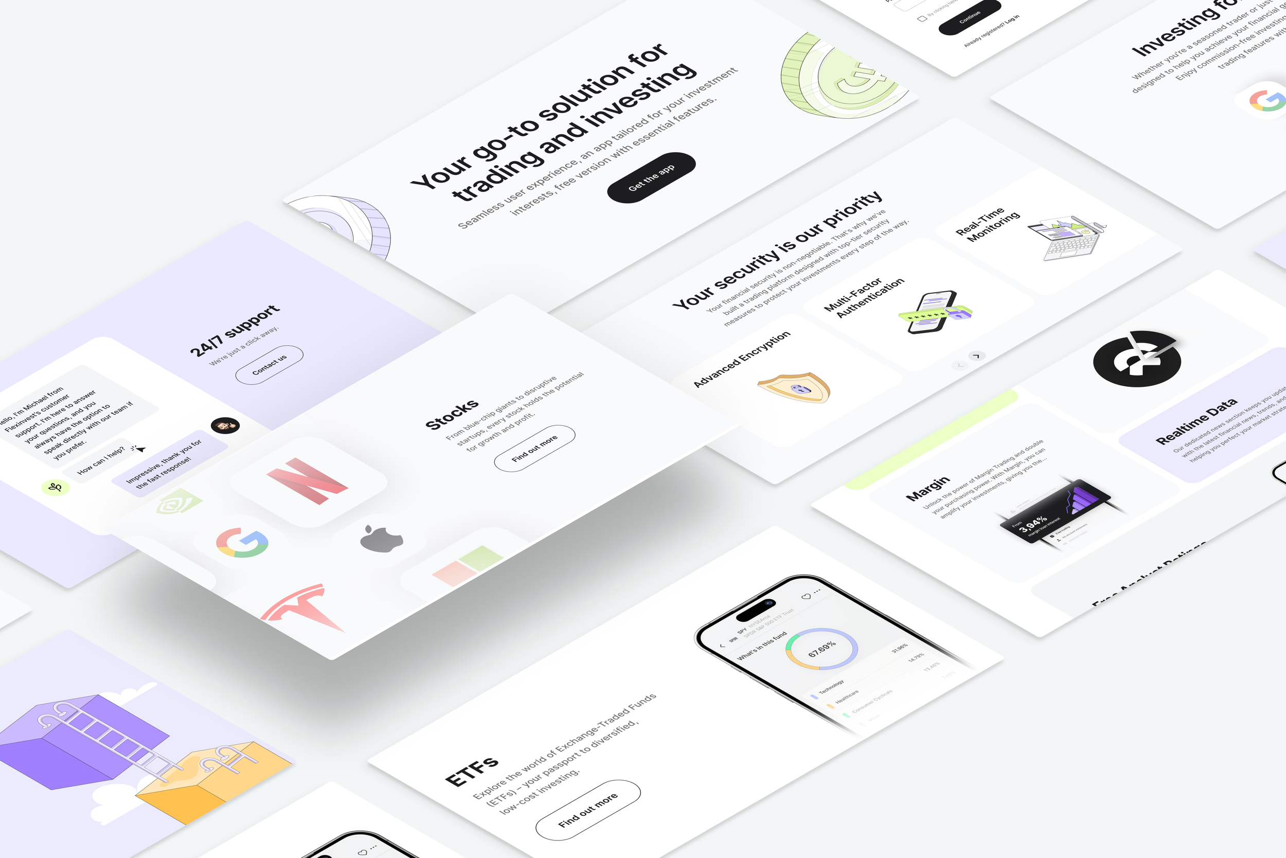
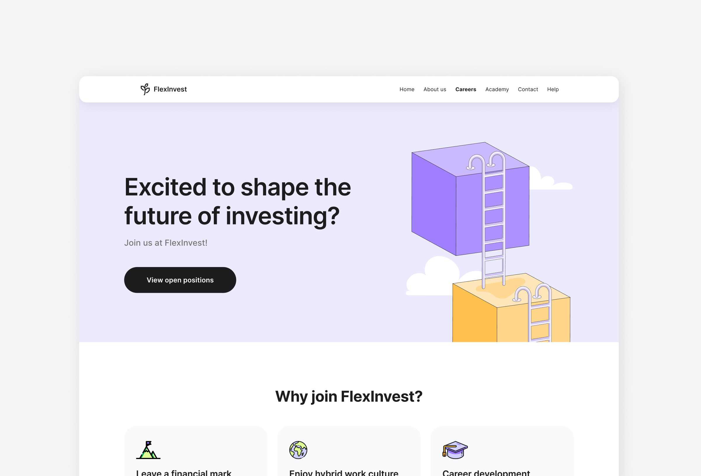
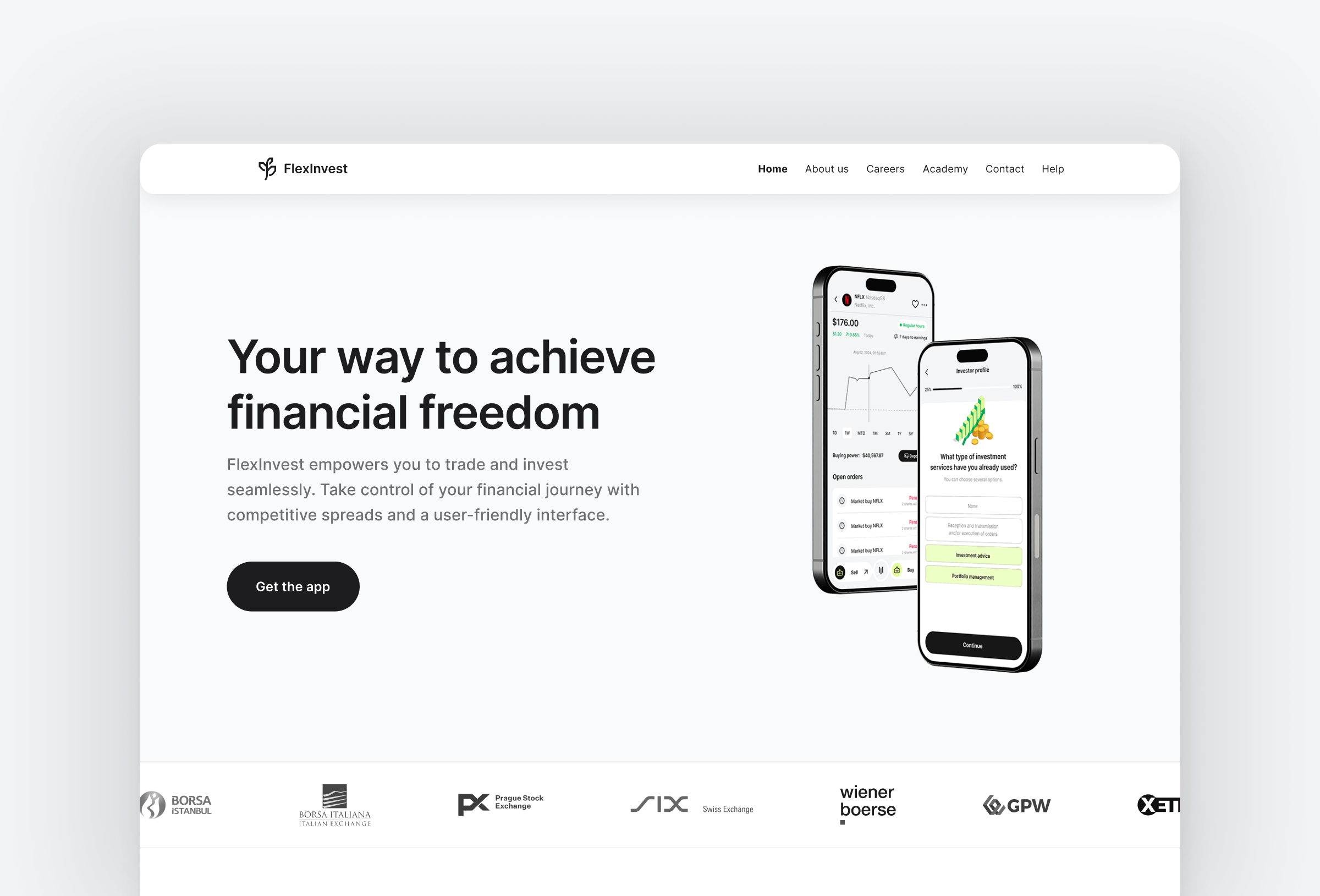
Through strategic UX research, iterative design, and user feedback, we successfully created FlexInvest, an intuitive, beginner-friendly trading app that balances accessibility, automation, and transparency. By addressing user concerns and optimizing key touchpoints, we delivered a seamless investing experience that empowers users with confidence.
Conclusion

Design Process
-
Conducted comprehensive research into user needs and pain points.
-
Gathered insights from analytics and user feedback.
-
Developed a clearer, more efficient app structure.
-
Created a visually appealing and intuitive interface.
-
Iterated based on user testing and feedback.
-
Worked closely with developers to bring the design to life and correct errors.